Main Content
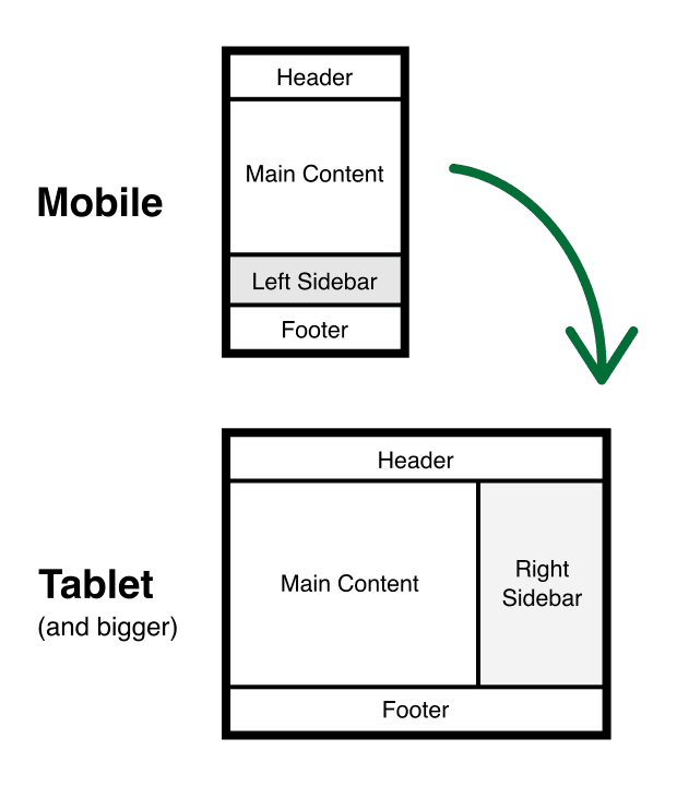
This layout responds to all screen sizes. Here are the two layouts it uses for mobile and tablet breakpoints: (Change the size of your browser window to see the layout adjust.)
This layout responds to all screen sizes. Here are the two layouts it uses for mobile and tablet breakpoints: (Change the size of your browser window to see the layout adjust.)